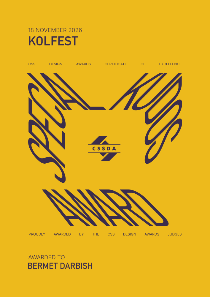
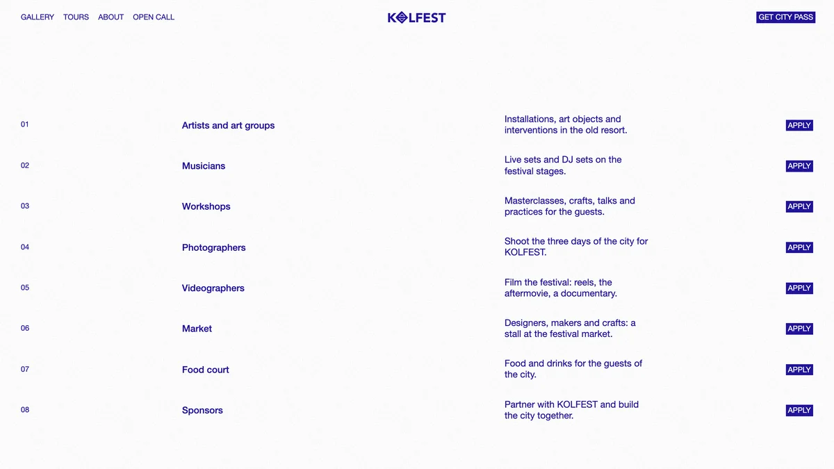
Kolfest
Visit site
I've been designing products for almost four years, and I keep trying other kinds of design out of curiosity. I could go on, but you're better off just looking at the work

Going paperless across
the state vehicle fleet
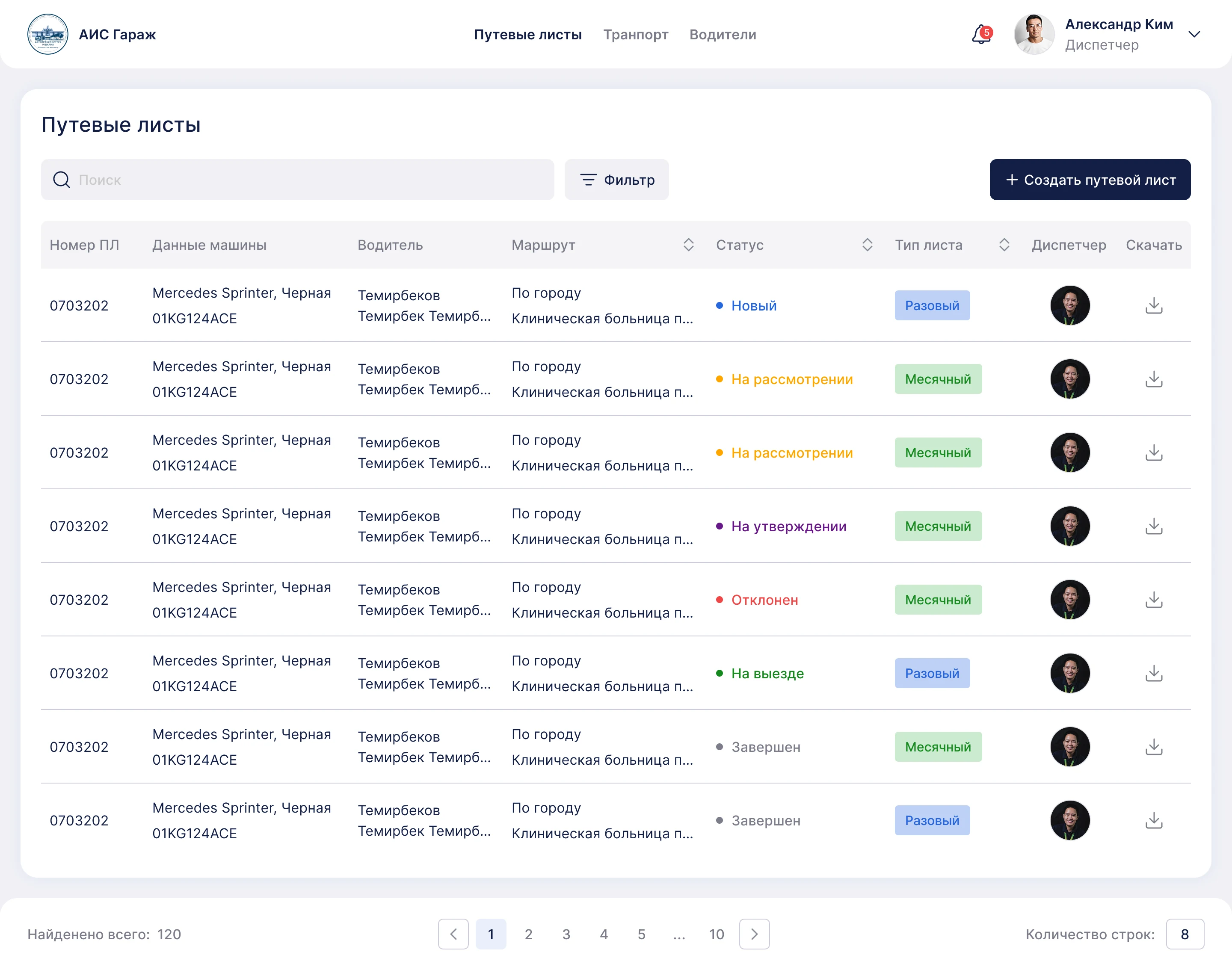
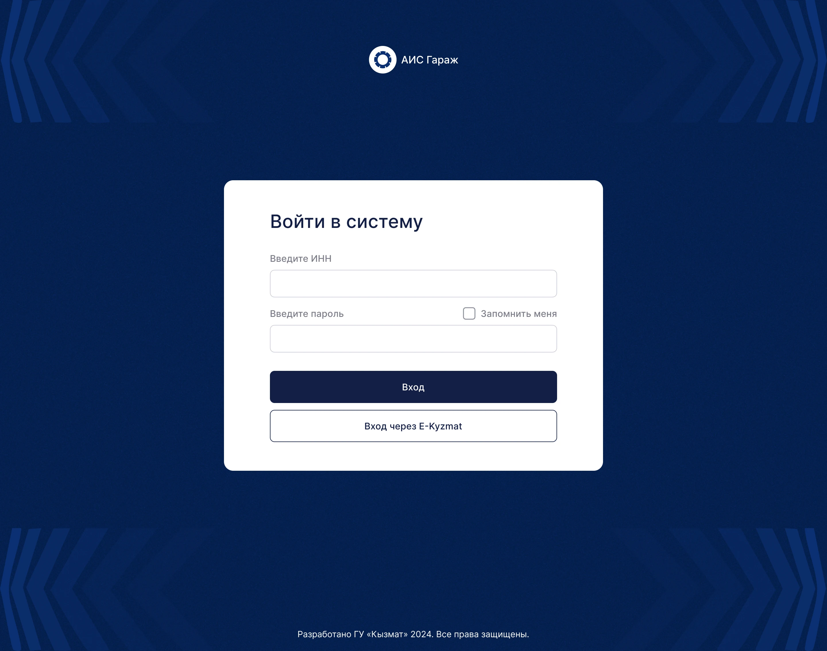
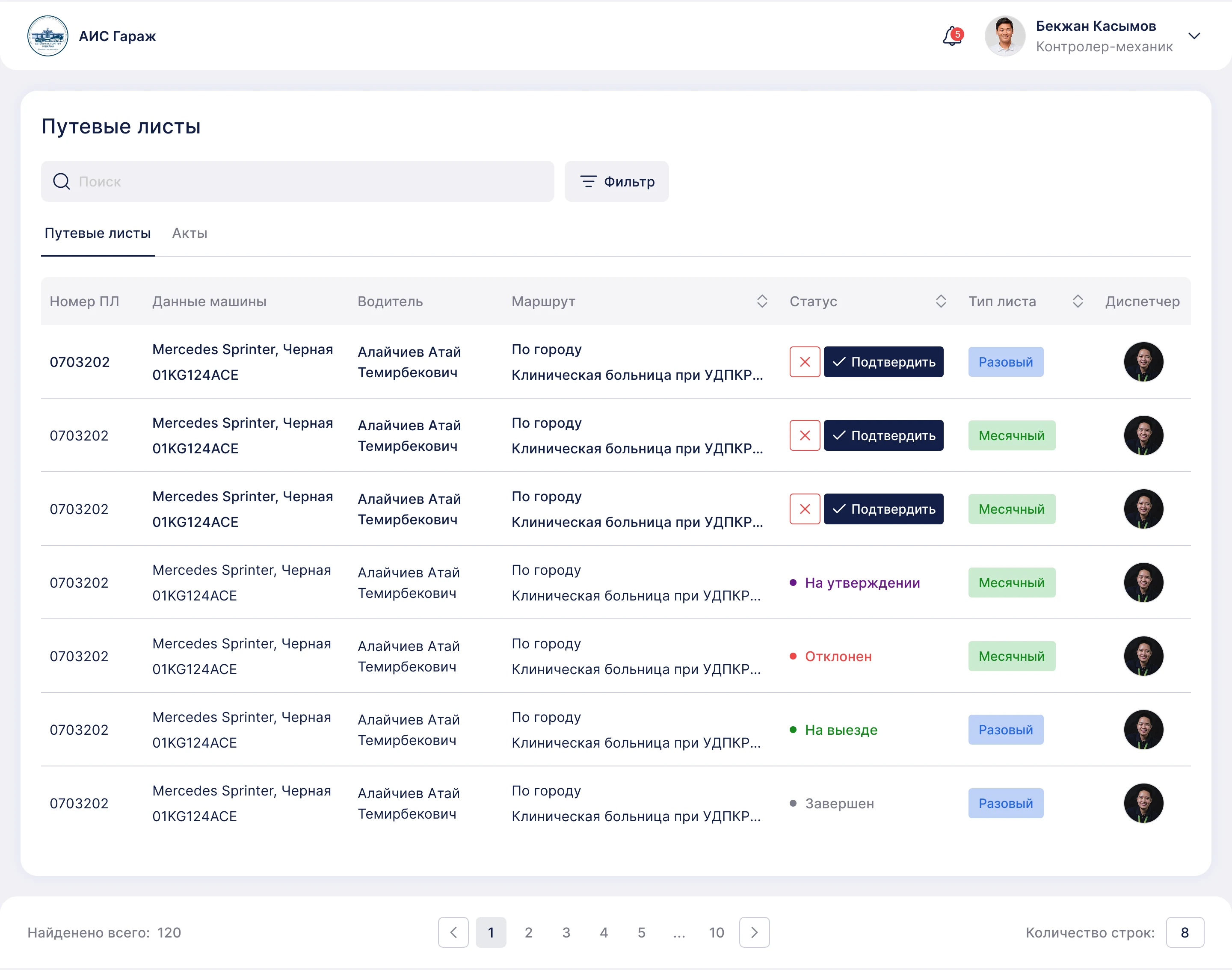
AIS Garage is an internal state-owned fleet management platform, not public-facing, designed to digitize and automate vehicle operations for 10+ different roles in government transport departments.
Everything ran on paper. Documents got lost and things got forgotten. The older generation was fine with it, but it wasn't convenient for younger staff.
The company's main request was to create a system that:
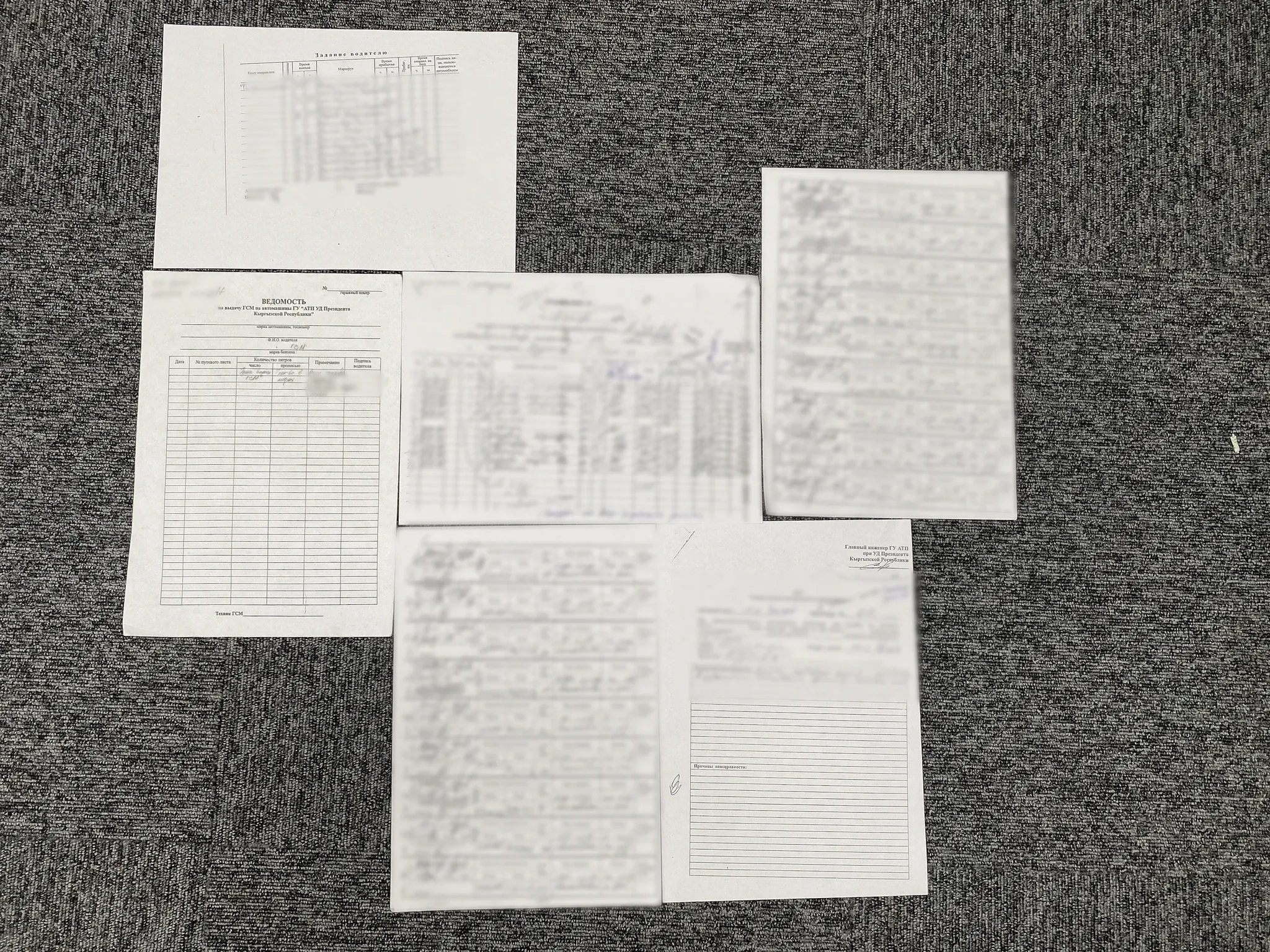
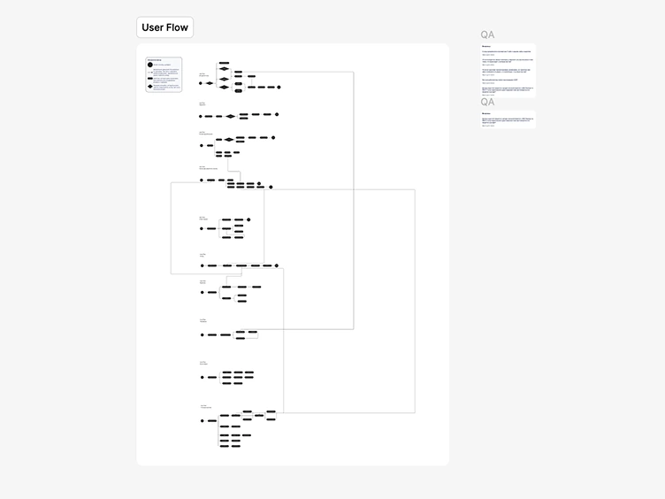
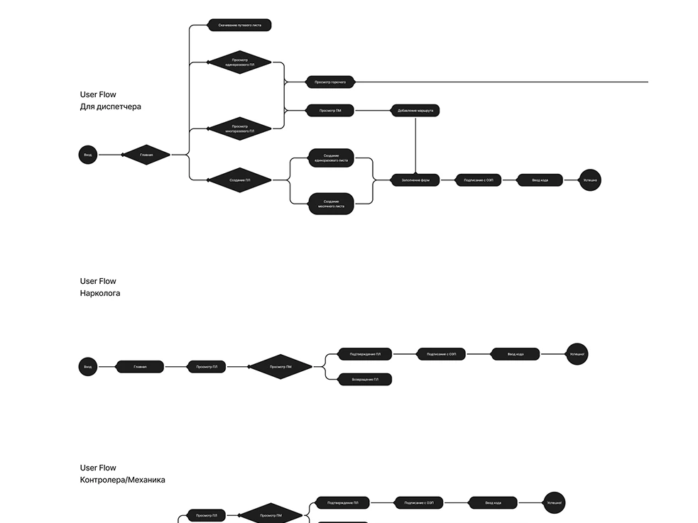
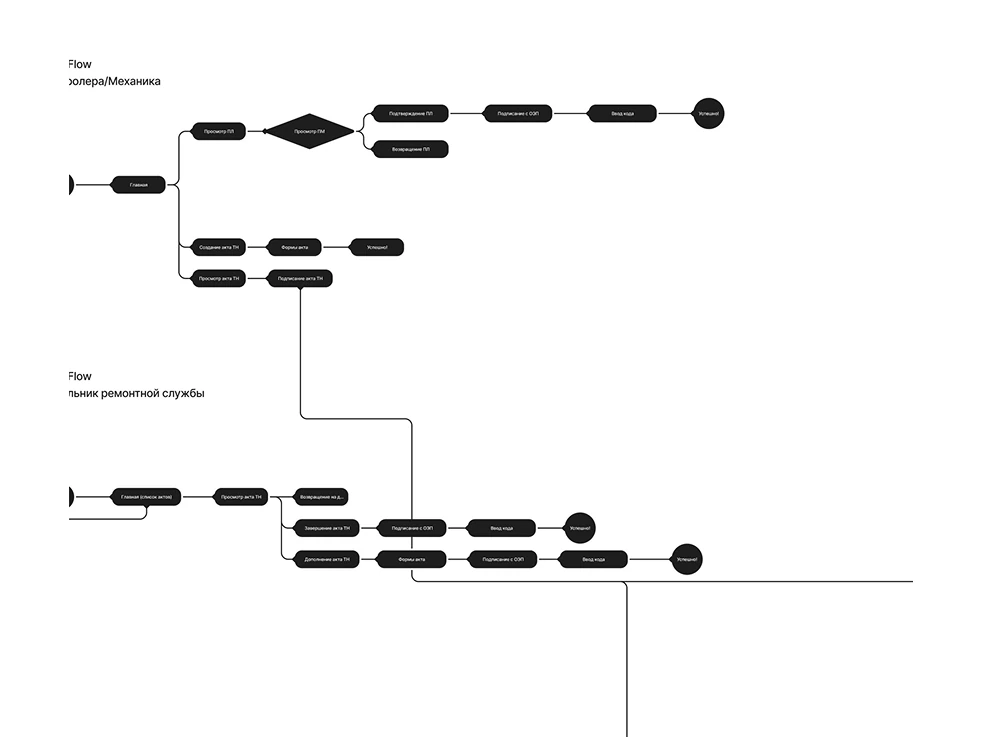
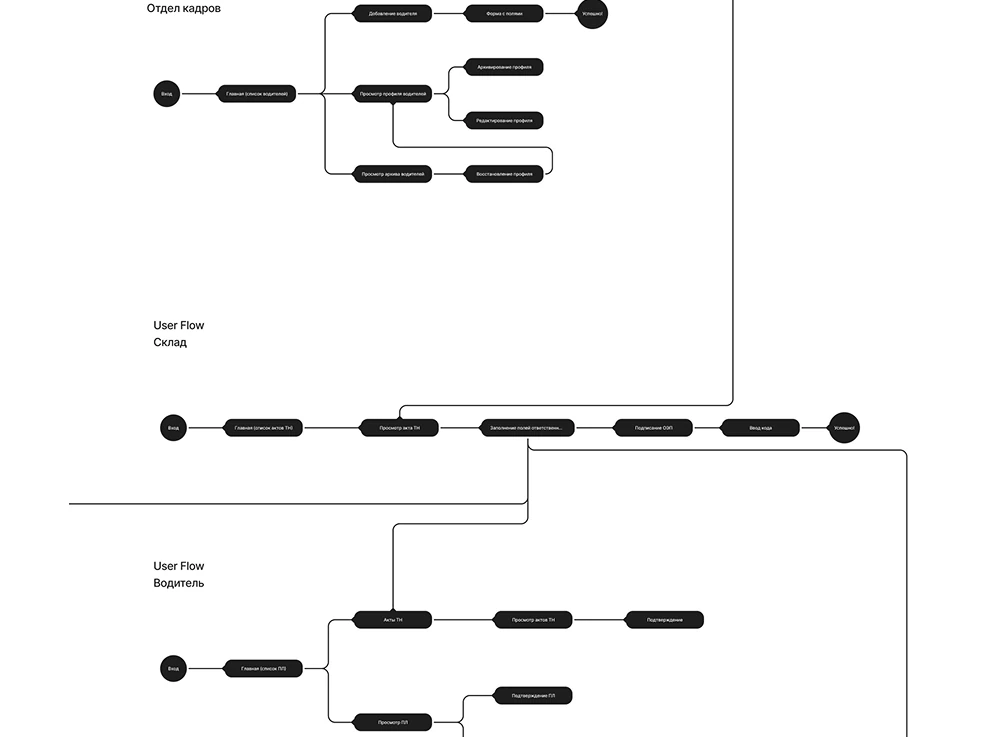
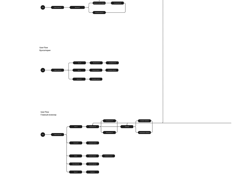
The main task was to understand the roles really well.
I went through each role's paperwork and mapped a user flow from it. Then I designed the interface for each role, one at a time.
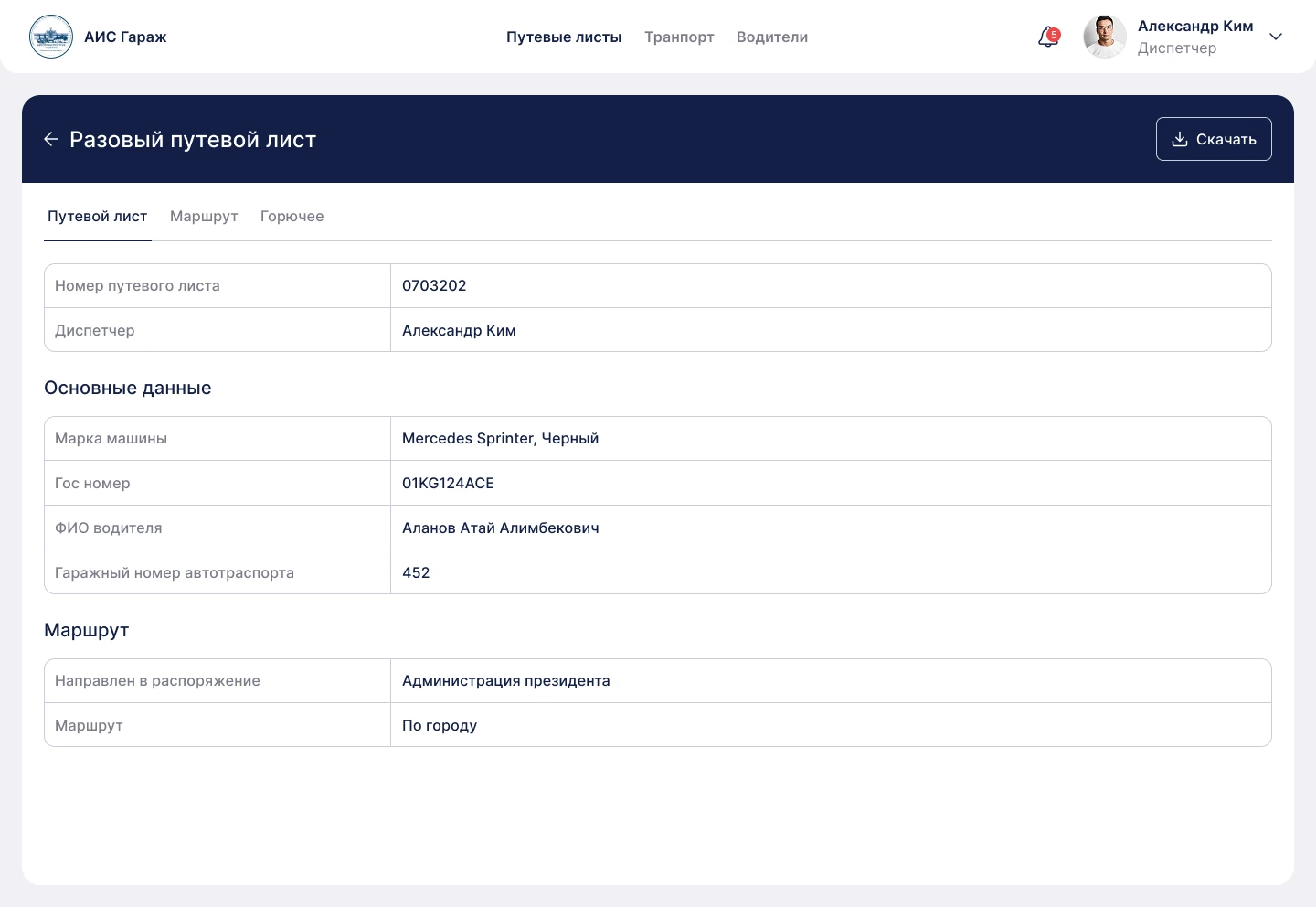
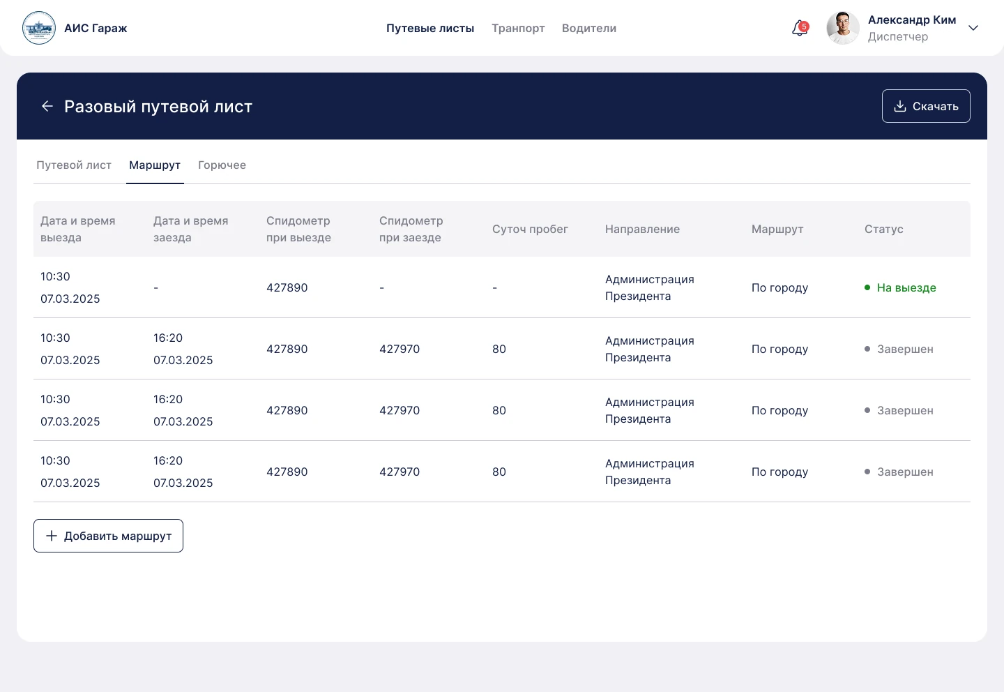
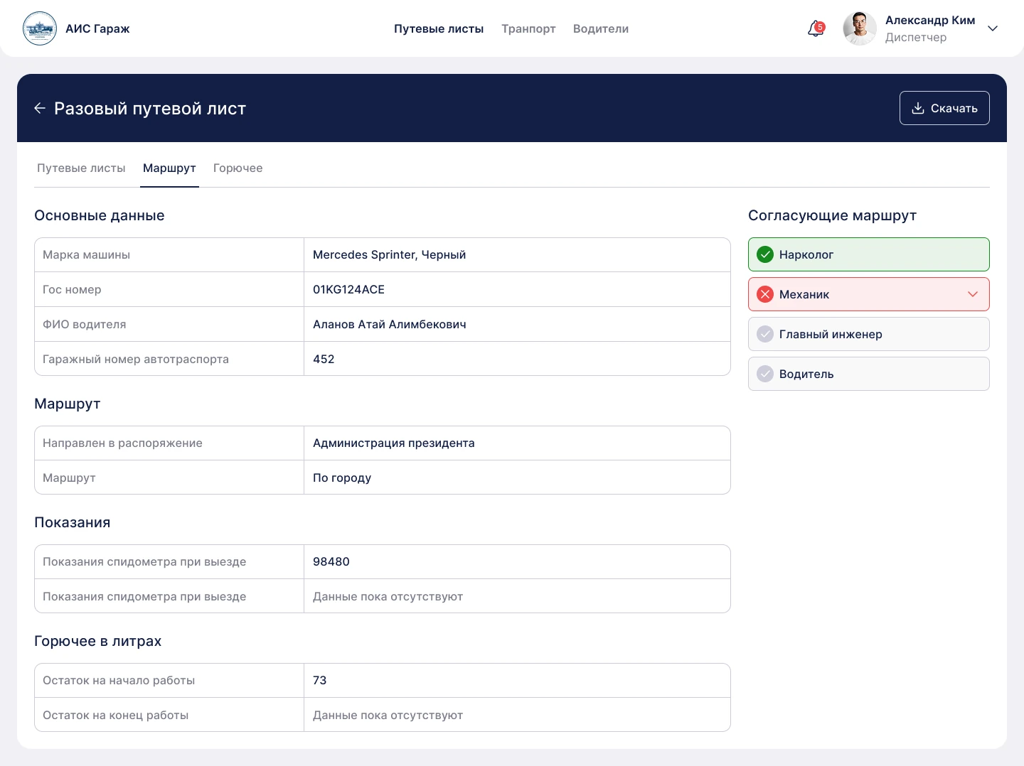
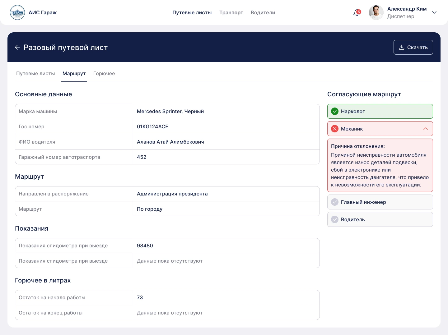
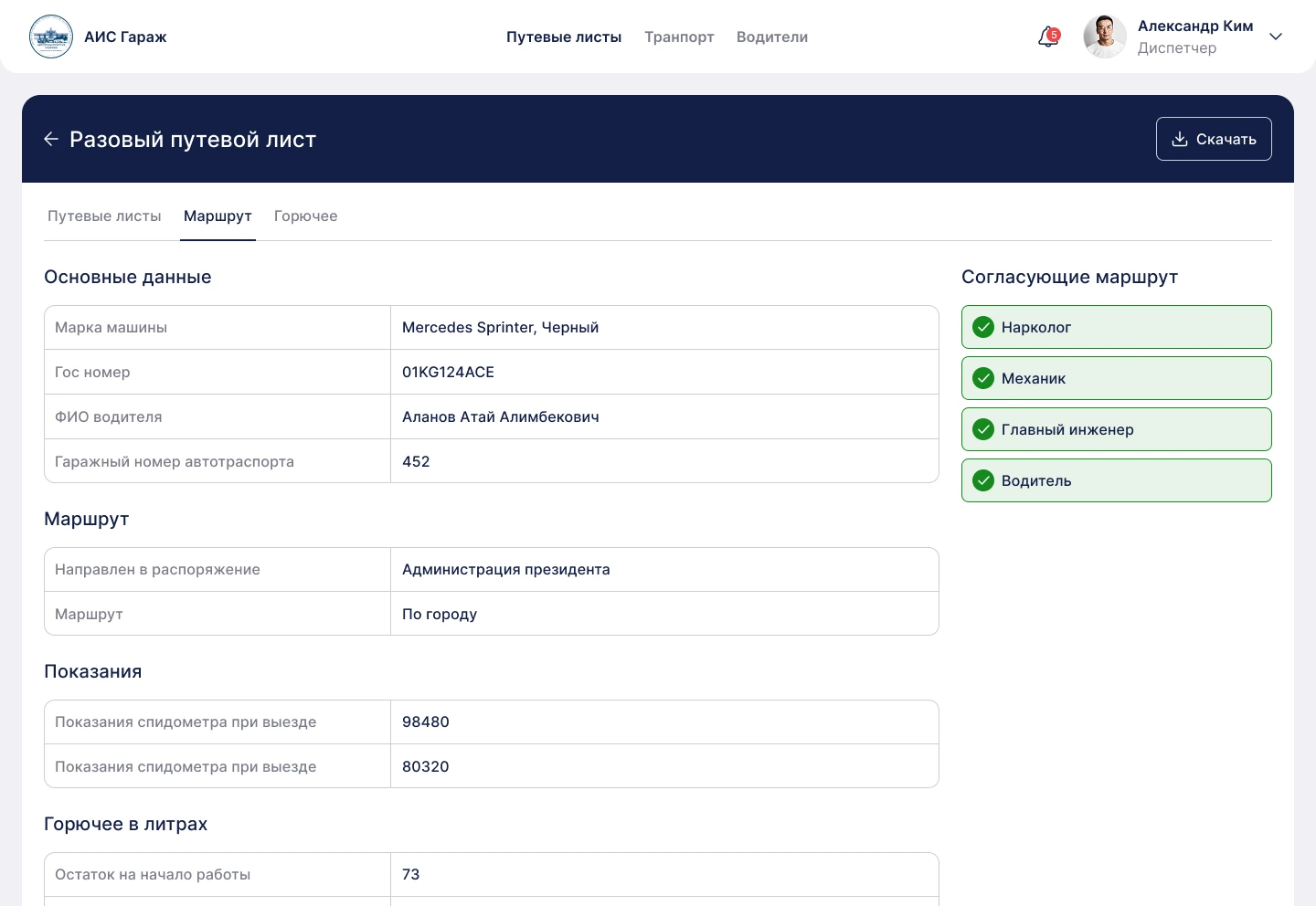
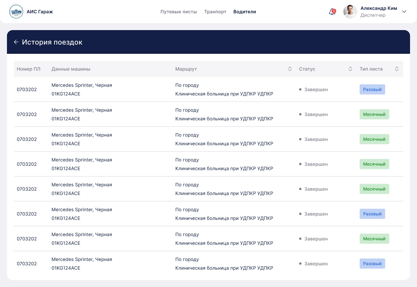
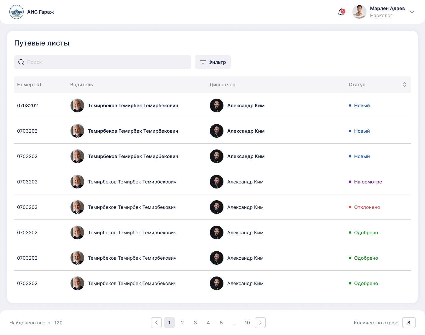
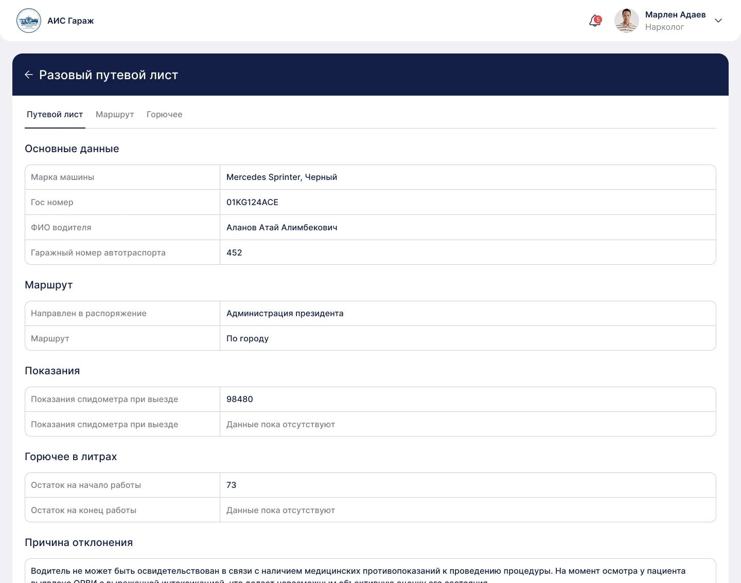
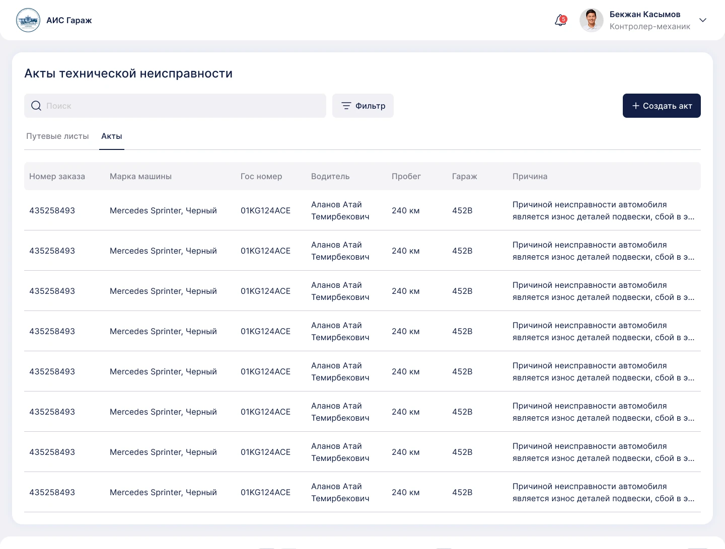
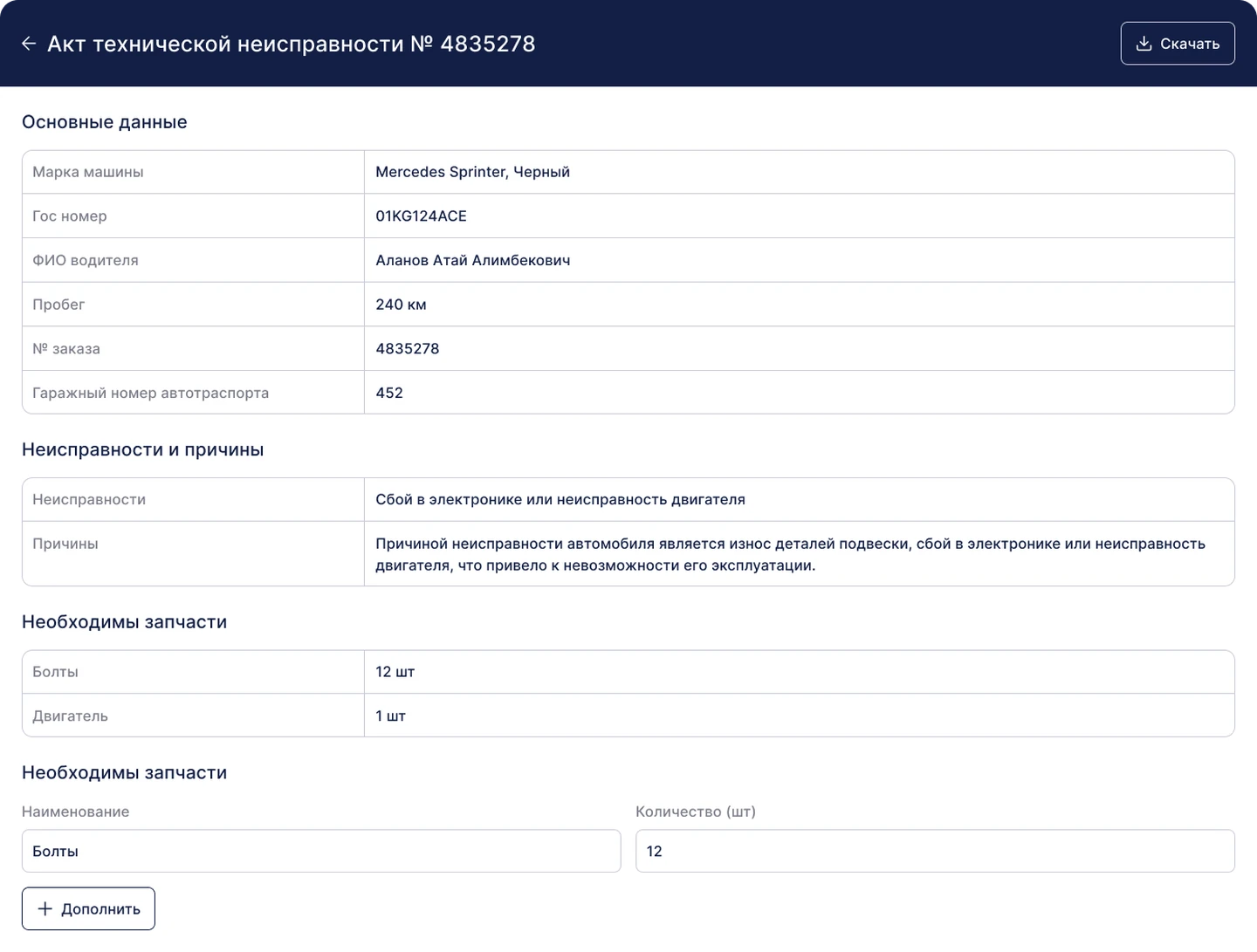
The system covers:
Digitizing the diplomatic
service of the Kyrgyz Republic
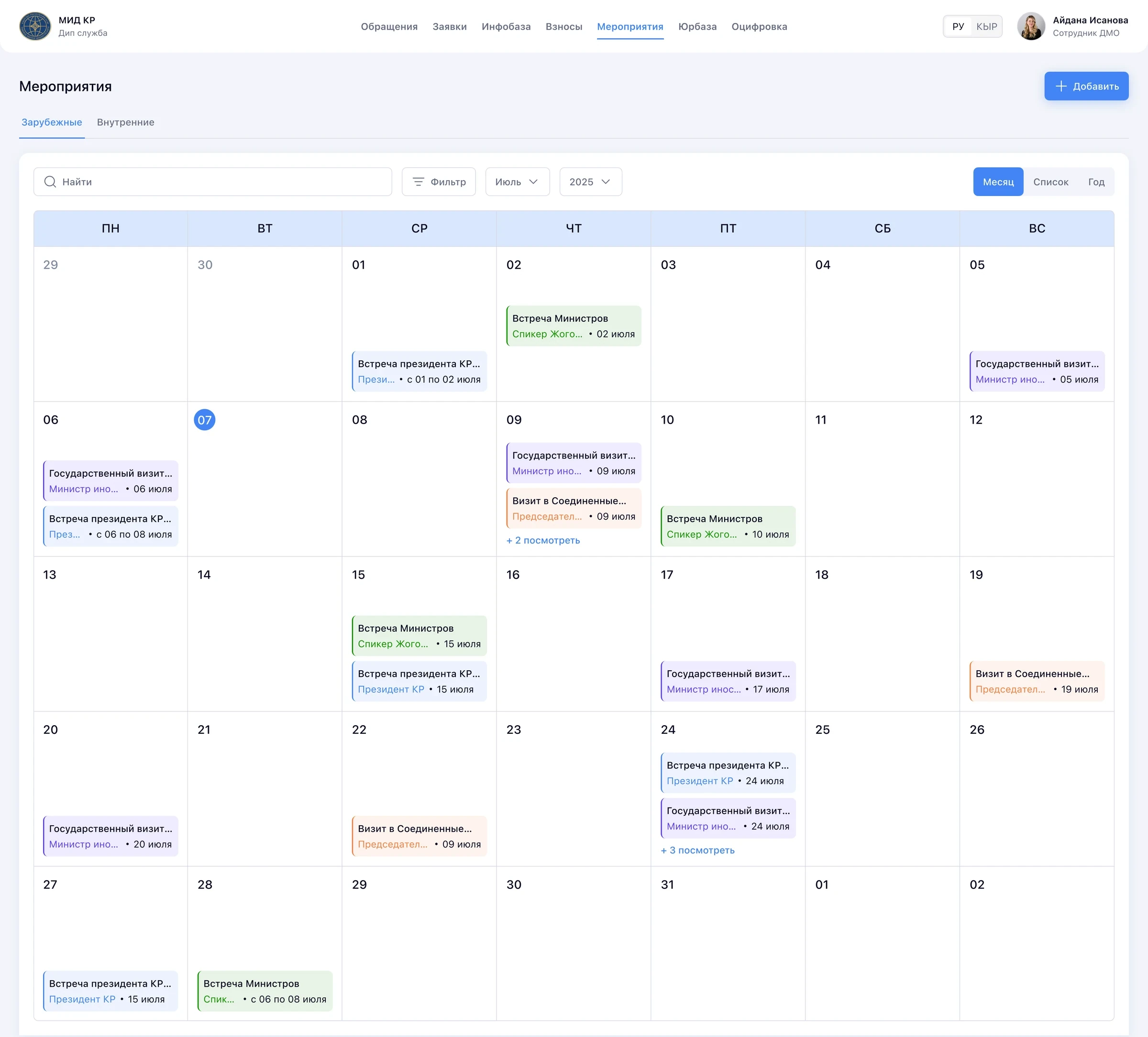
AIS Diplomatic Service is a governmental platform for the management of diplomatic affairs, designed to digitalize and automate processes of international cooperation.
The Ministry coordinates missions, treaties, events and correspondence every day, but its old system covered only a few basic functions.
Most of the work still happened outside the system. The Ministry already had a clear request for what it needed, so our job was not to invent the product, but to build the missing modules and make the whole platform easy to use.
The system holds a huge amount of text, so it was laid out like an Excel sheet, and staff had to scroll sideways to see it all. By the time they got to the end of a row, they had lost its beginning, and their eyes kept jumping from left to right and back.
Meanwhile, the left navigation took up 20% of the screen width, with only 3 tabs in it.
We were adding four more tabs, so at first I assumed we still needed the left navigation. But it would have gone on taking up 20% of the screen.
Instead of keeping the left navigation, I moved the tabs to the header. All 7 fit without any trouble, and no more were planned, so we got that 20% of the screen back.
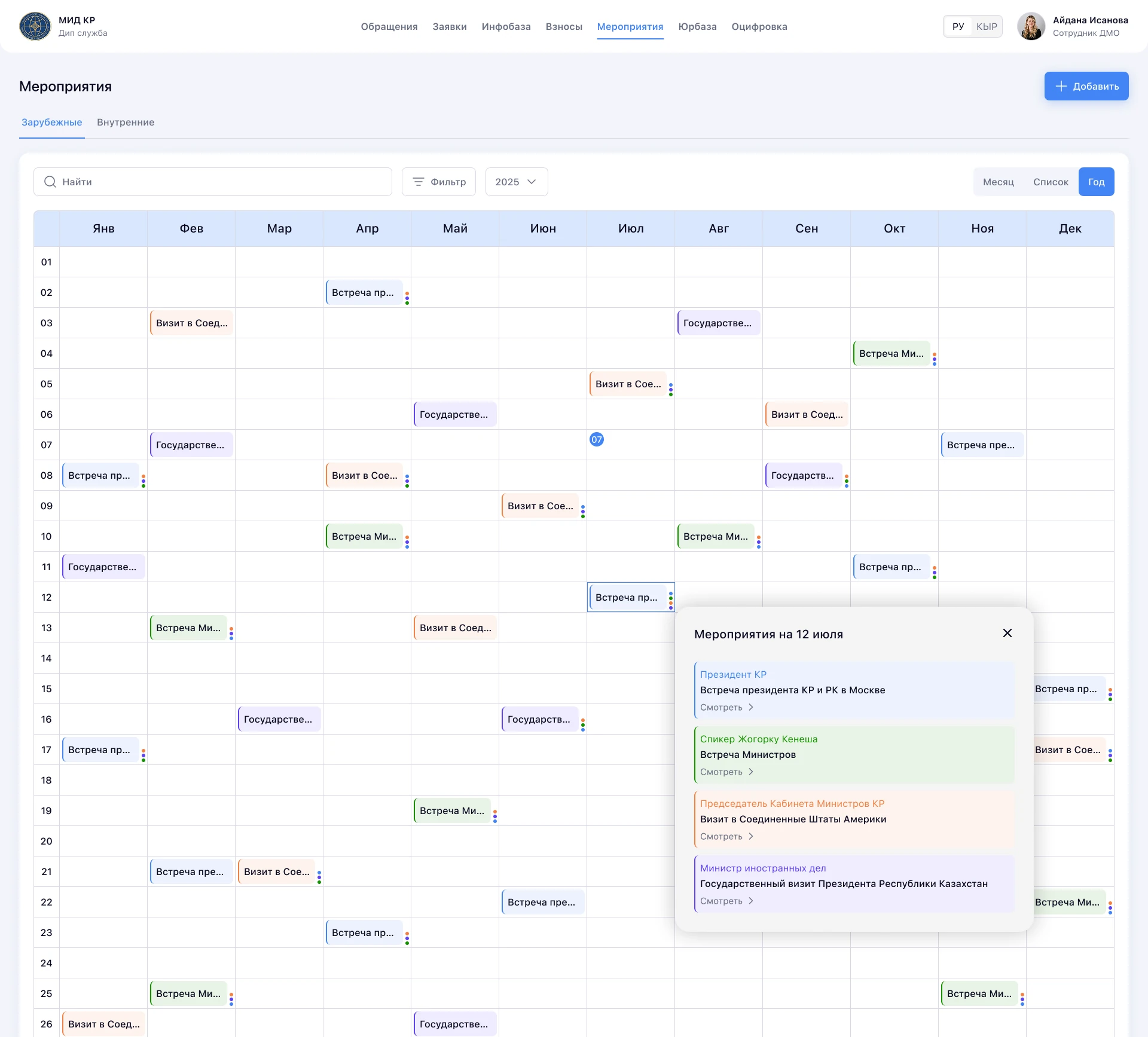
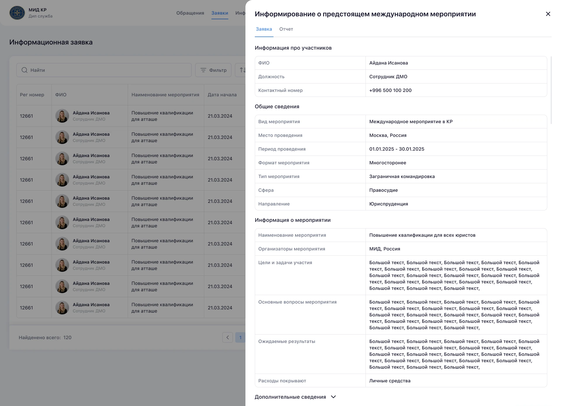
A survey also showed there was no need to show everything in one line. Instead of long rows, tables now show only the priority information, with two lines of text in each cell so more fits, and a click opens a side modal with all of it in one place, so nobody has to look from left to right and back.
Together, these decisions removed horizontal scrolling completely.
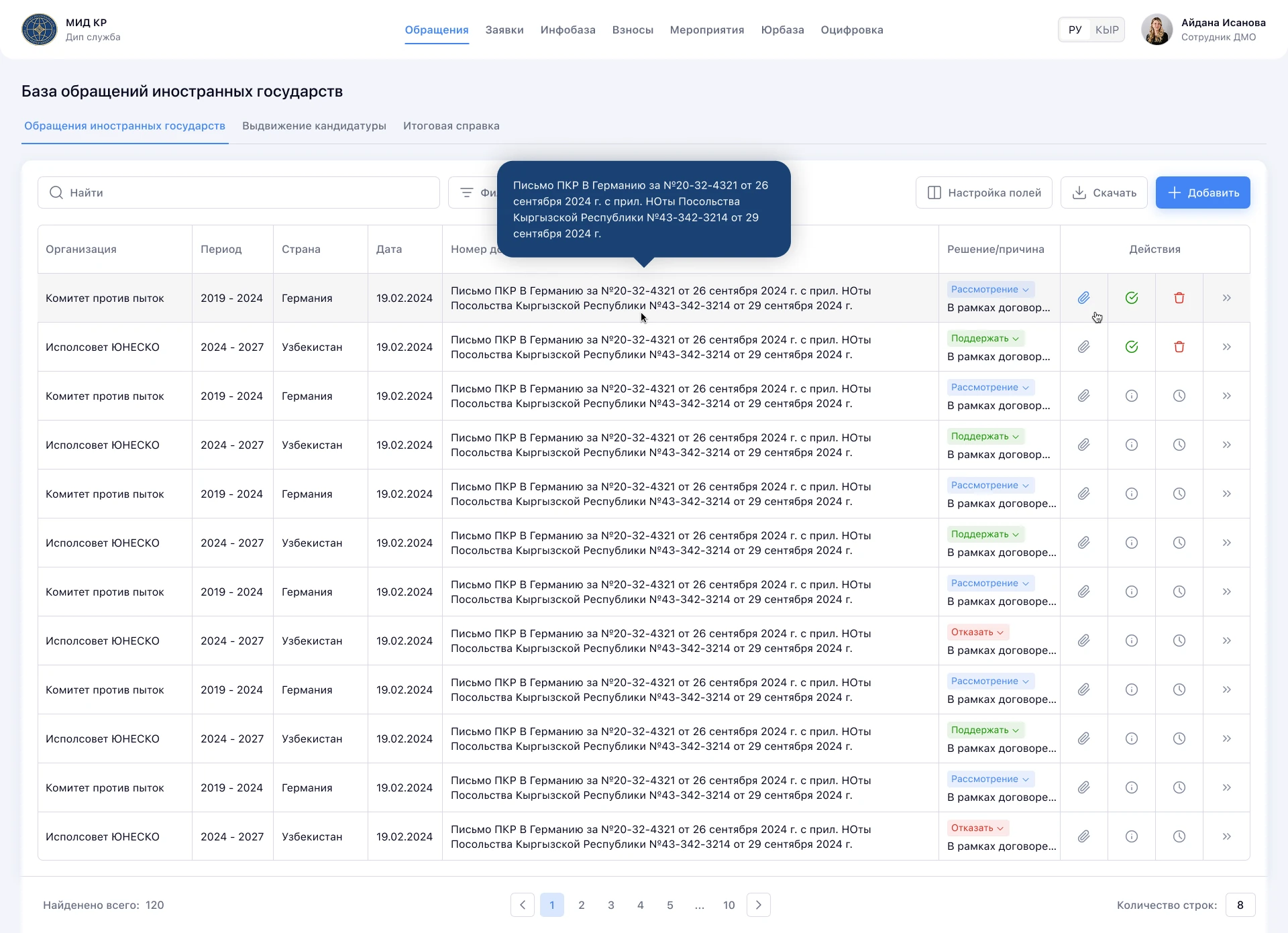
Statuses used to be typed by hand and stored as plain text. That had one real advantage: staff could write right on top of a cell. But plain text didn't show the state of things very well.
We kept the option to change a cell right away, without opening anything, and added colors that show each status more clearly.
We used the same colors when we built the calendar, so a gray platform got a bit of color.
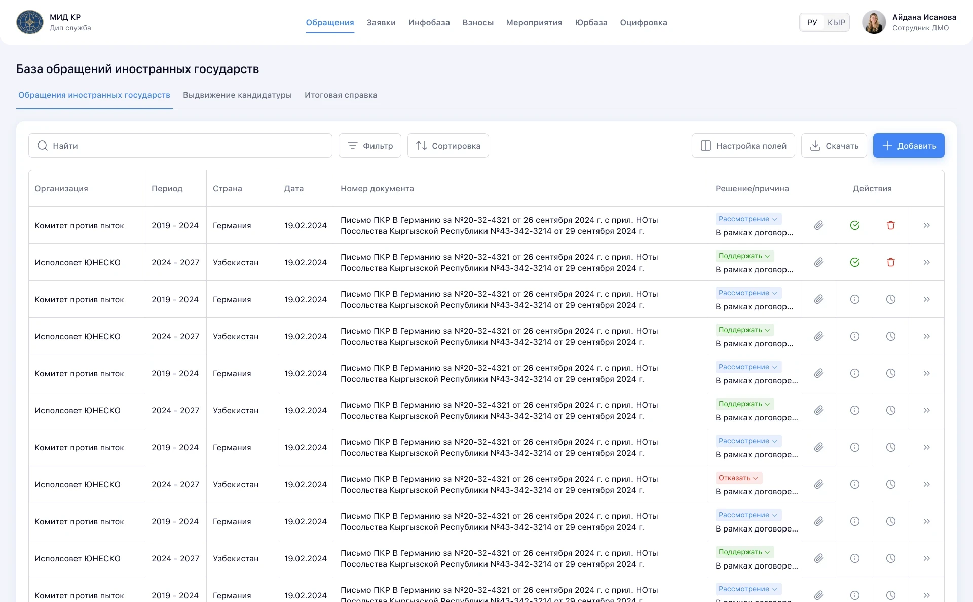
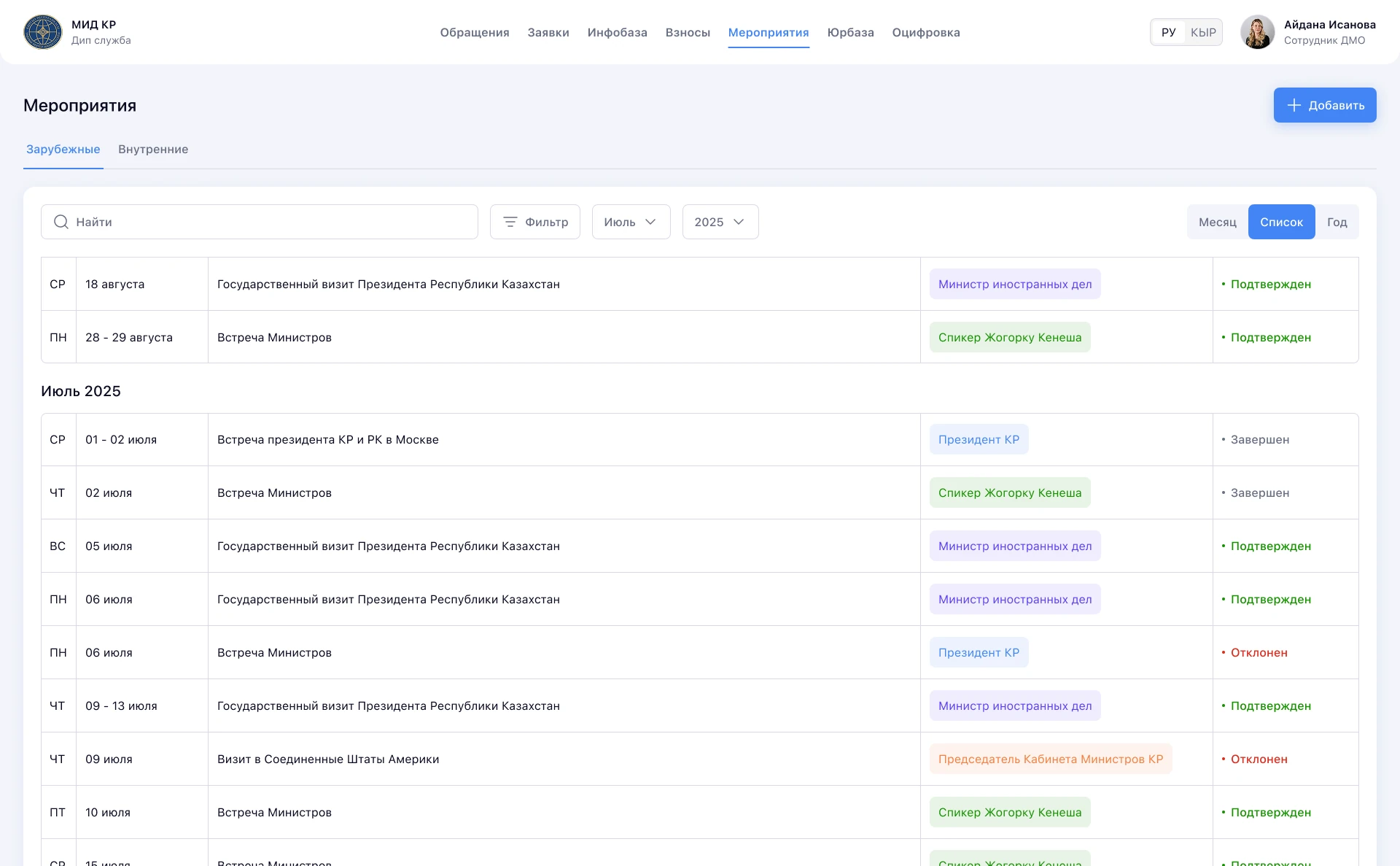
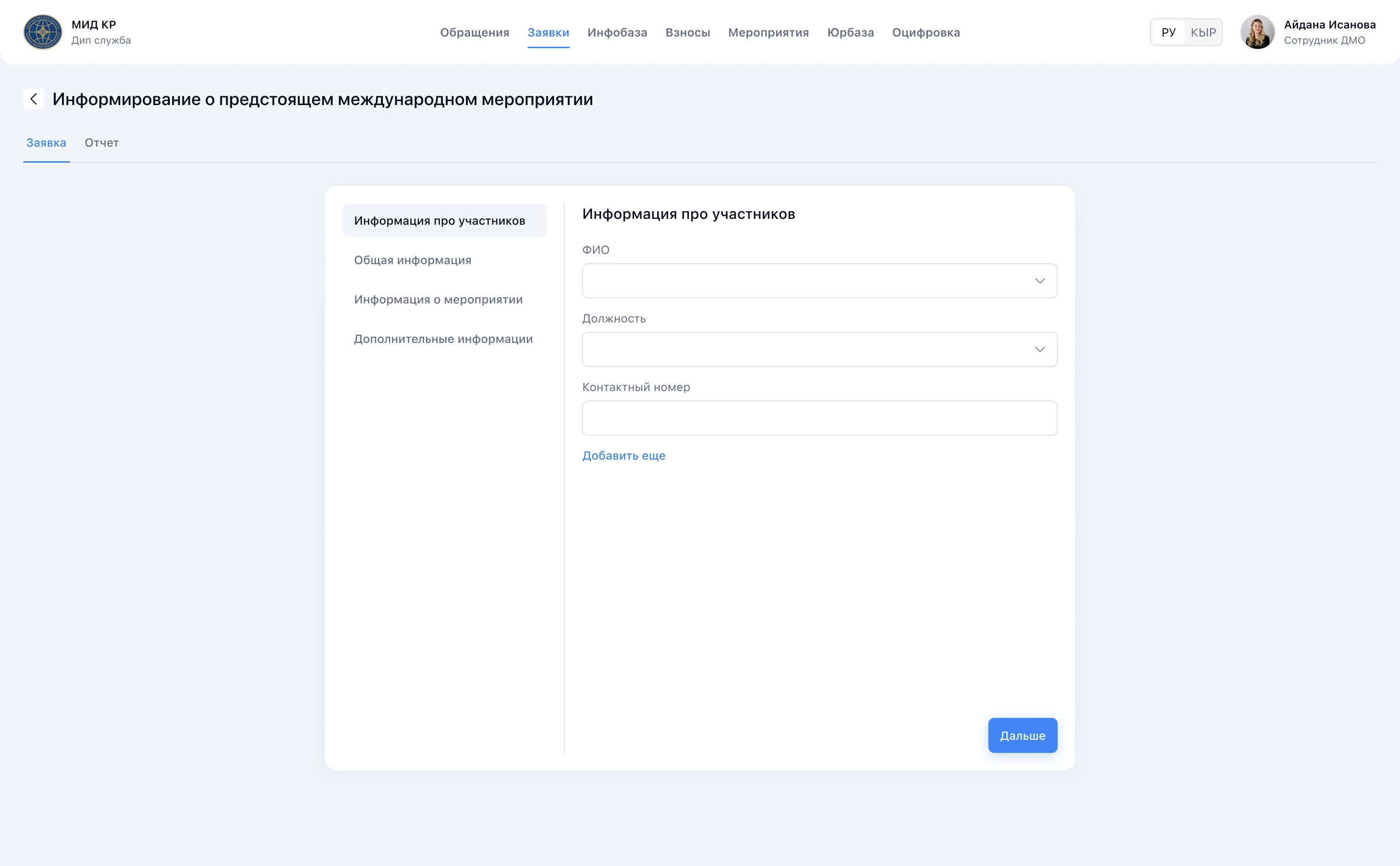
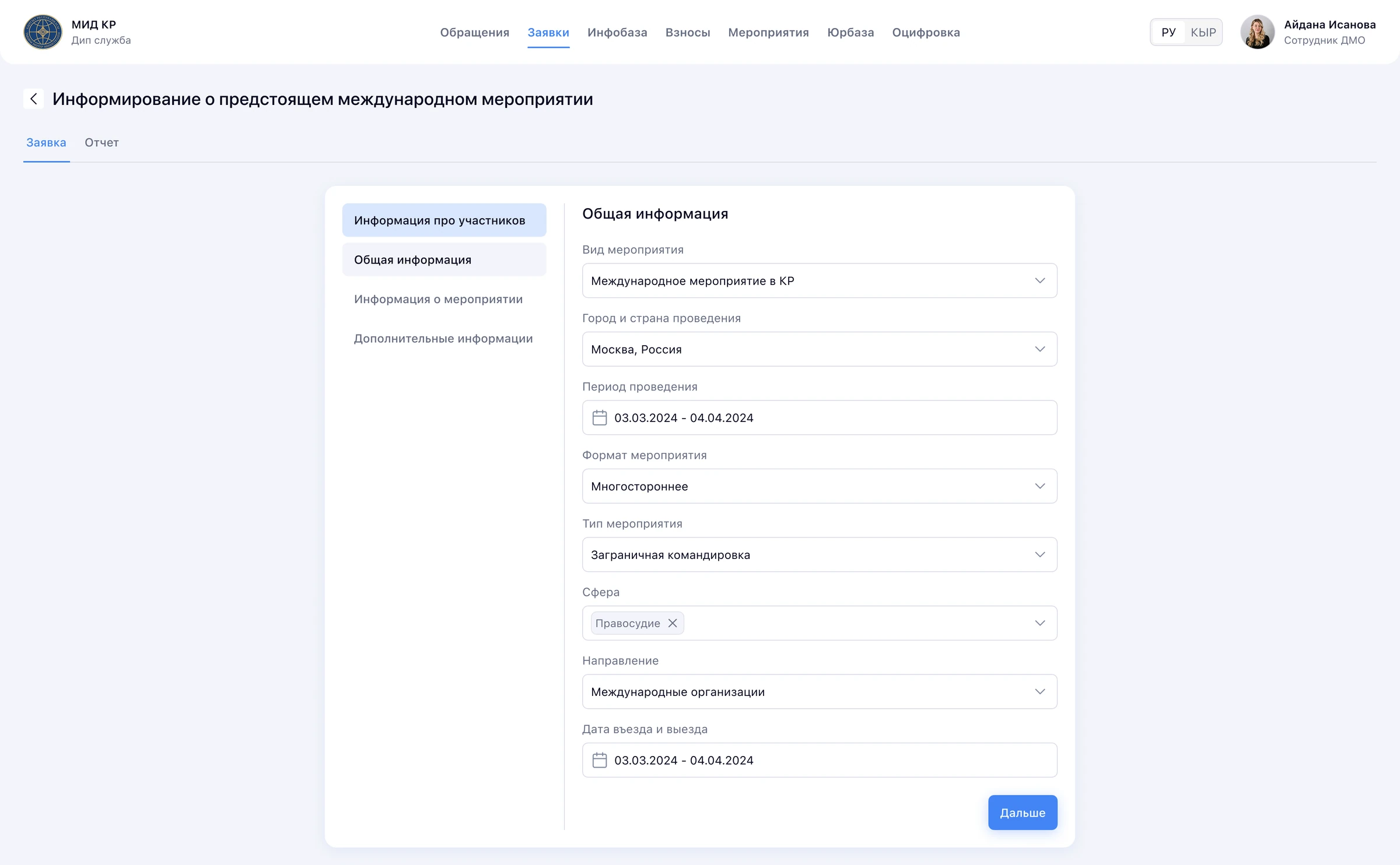
The platform now covers:
Government projects can look boring from the outside, but they're full of interesting challenges, and those lead to interesting solutions.
Storage is a place where I explore different directions without overthinking. Some of these ideas grow into real projects, while others simply stay here.